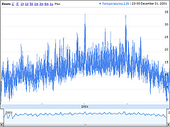
05 Aug, 2009Graph - Annual Temperatures (Google)
The graph is one of my experiments with Google's Visualisation API as a possible means of interactive web-based data presentation. It's an implementation of an annotated time line graph that Google originally developed for showing stock exchange data - used here to show annual hourly air temperature values. It has to process a whole year's worth of hourly temperature data for San Francisco, so it can take a little while for the graph to first appear.
