WEATHER DATA
This web app lets you load and display EnergyPlus weather data in a 3D graph with data averaging and animated sectioning. It maps the full range of weather data metrics against day of the year and hour of the day to create an undulating 3D surface plot. You can interactively adjust the displayed metric, the graph size and scale, section planes and data averaging parameters. Simply drag&drop a .EPW file anywhere in the browser windows and you are ready to go.
The aim of this app is to read and display EnergyPlus weather data files (*.EPW). These files contain annual hourly data for a range of weather metrics for stations around the world and are available from either the EnergyPlus Weather Data Website or Climate.OneBuilding.Org .
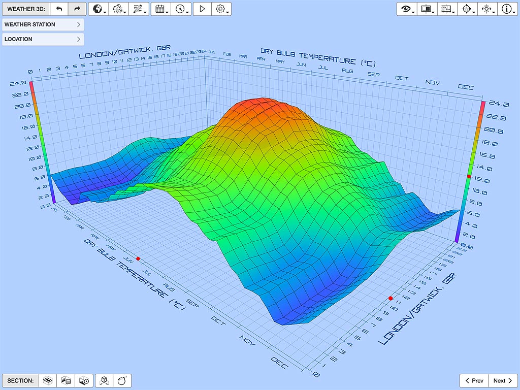
You can load a weather data file by simply dragging and dropping it anywhere within the app browser window or using the Load Weather File... menu item. Once loaded, the data for each weather metric is shown as a 3D graph which maps day of the year in the X-axis, hour of the day in the Y-axis and data value in the Z-axis to produce an undulating 3D surface.

Interesting Features
I did this app to verify visually that I was reading the EPW file format correctly and extracting valid data for each of the different weather metrics. It was also an opportunity to port my graph/chart libraries over to JavaScript and WebGL. You’d think that charts and graphs would be pretty straightforward by now, especially as I have coded quite a few over the years in different languages and on different systems. However, every time I do one they end up being quite a challenge as there is a lot more to them than you’d imagine - but I think this is close to my best one yet.
Dynamic Transitioning
With this library, I tried to create a pretty flexible set of base classes with support for interactive sectioning and dynamic transitions. For me, dynamic and animated transitioning between states is quite important as it is a useful way of emphasising subtle differences in data that may otherwise be overlooked. Moreover, it is a very intuitive way of doing this without requiring extra cognitive load as watching how things change as they move is something we all do all the time.
To see transitions in action, load a weather data file and then use the < Prev/Next > buttons in the bottom right corner of the app or the M key to cycle through the various weather metrics in the file.
In order to be effective, transitions, animations and interactions need to be smooth and responsive - which means maintaining high frame rates with super-fast redraws. This in turn means synchonising, optimising and reusing absolutely everything you can - no immutable data structures or accumulated garbage collection allowed. I’m starting to get a bit better at this now and my animation libraries have moved on a bit too, so hopefully interactions are starting to feel more responsive and direct. However, given the way optimising compilers work, you will need to drag things around a bit first for a second or so before that part of the code gets fully optimised.


If you have a bit of time, playing around with some of the settings in the TRANSITION panel is worth it as there may be some interesting combinations that help communicate or illustate a particular weather concept, especially if you ever need to give a tutorial or explain it to a client.
Contour Mapping
This was also an opportunity to have another go at contour banding as my first attempt in the daylight analysis app wasn’t as robust as I would have liked. It’s relatively easy and fast to generate contour lines over a surface grid, but turning them into polygons and tessellating them to produce filled bands certainly isn’t, especially when they contain multiple holes or even internal islands. However, I’m pretty sure I’ve cracked it now so I’ll go back and update the daylight tool when I can.


You can display a sectional contour at any time by toggling left-most section button in the bottom left corner of the app, dragging the horizontal section indicator or pressing the V key.
Sectioning
Seeing the 3D surface is one thing, but being able to cut a section through or progressively expose parts of it can sometimes really help. Thus, you can section the data in each axis by simply dragging any of the three section indicators in the graph, setting them explicitly in the 3D CROSS SECTIONS panel or pressing the T, Y or U keys to step the time, date and value sections respectively.
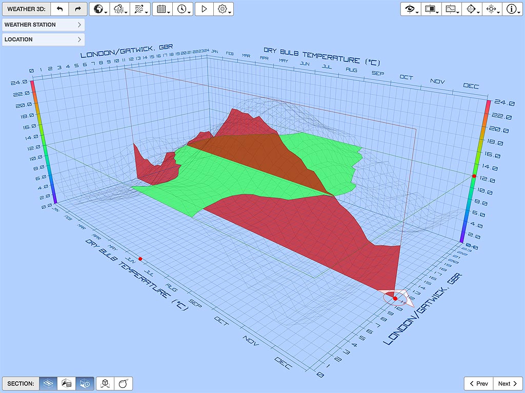

In addition to standard cross sections as shown in Figure 5a, you can also choose to view the grid as a sectioned block, as shown on Figure 5b. In this view, the grid surface is only drawn on the other side of each section plane from the current view position. You can toggle this using the block toggle button just after the three section buttons on the bottom left corner of the app, or using the B key.
Pixel-Perfect Scales
The other issue I wanted to tackle in these graphs was a proper implementation of non-linear color scales, basically legends that transition between more than two colors (e.g.: blue-to-green-to-yellow-to-red). When using such a scale with data that fluctuates wildly, as most weather data does, a triangulated grid with a color-per-vertex shader does not always give the most accurate color representation.


As shown in Figure 6a, GPUs only do a linear interpolation of colors between vertices so, when a single triangle spans over a wide section of the scale range, it likely won’t show the right color variation or you may end up with small areas having a hue that doesn’t actually occur anywhere within the color scale being used. I have noticed this in a couple of previous projects and it has bugged me for a while, so I was really keen to experiment with a more accurate pixel-based color scale in these graphs. Figure 6b shows the same graph and data, but using a custom color-per-pixel shader to color the surface.
Data Averaging
Weather data can fluctuate wildly from day to day and even hour by hour, so some form of averaging is usually required in order to better identify trends. I have found that using a rolling average to smooth out daily fluctuations provides a particularly useful insight for this type of data. This basically means calculating the hourly data for each day by averaging over a given number of days both before and after it. Figure 7 below shows just how clearly this approach can clarify trends in what appears at first sight to be almost random values.


Using a 28 day rolling average period for example, the 1st of January becomes the average of the last 14 days of the previous year and the first 14 days of the given year. For the 2nd of January, the hourly data from the 18th of December is subtracted from the running total and that from the 15th of January is added, and so on. As EnergyPlus weather files provide a representative year for each weather station, the previous year is assumed to be exactly the same as the given year so the data is simply wrapped.
Future Development
This graph is basically an implementation of my base 3D graph classes customised specifically for annual hourly weather data. However, I think there is probably some utility in doing another app that fully exposes a more flexible 3D graph that can show any type of 3D data. The trick for doing this efficiently is to not make the app deal with all the vagaries of defining and importing arbitrary data formats. Google has a great tool for manipulating and reformatting any type of data, so my next step should really be trying to figure out how to sync up with that.
I have also been experimenting with embedding Blockly in some of my tools as a way of allowing direct and secure access to the base model for programmatic manipulation. This is most likely the next major forward step for this app.
Obviously there are some additional refinements that I will work on when I have time, such as:
An option to display the actual value of each axial section as it is being dragged(see change log 0.0.2),The ability to double click/tap a section indicator and display a value editor popup,
Adding an extra section to each axis so that you can isolate bands of data within the graph, and
The ability to lock the scale when transitioning between weather data of the same type.
Change Log
0.0.2 2017-09-06
Fixed a slight offset issue with the date section and the metric mesh when using larger reporting periods. This meant that the mesh wasn’t being interpolated correctly so the sectional profile didn’t exactly match the displayed mesh.
Added a small popup annotation that shows the value of the currently selected date, time or value section. This annotation will appear whenever you select and/or interactively drag one of the section manipulators. It should automatically hide whenever you have finished dragging a section, or you can hide it at any time by simply deselecting the section manipulators by clicking/tapping in an empty area of the canvas. You can turn off this annotation completely by setting the
graph3d.showSectionValuePopupvalue tofalsein the Edit Settings as JSON dialog box.Added a couple of additional easing functions for controlling transitions.
Added the ability to double-click/tap any of the section manipulators to toggle the visibility of the related section. If using a keyboard, you can also the
X,CandVshortcuts to do the same.If using a keyboard, you can now dynamically increment any of the sections using the
T,YandUshortcuts for the date, time and value respectively. Holding theSHIFTkey with any of these shortcuts with decrement the value.Again, when using a keyboard you can hold down the
SHIFTkey whilst interactively dragging the section manipulators to snap only to the displayed axis tick values.
0.0.1 2017-06-01
- Initial release.